Landing page
Redesigned around the product
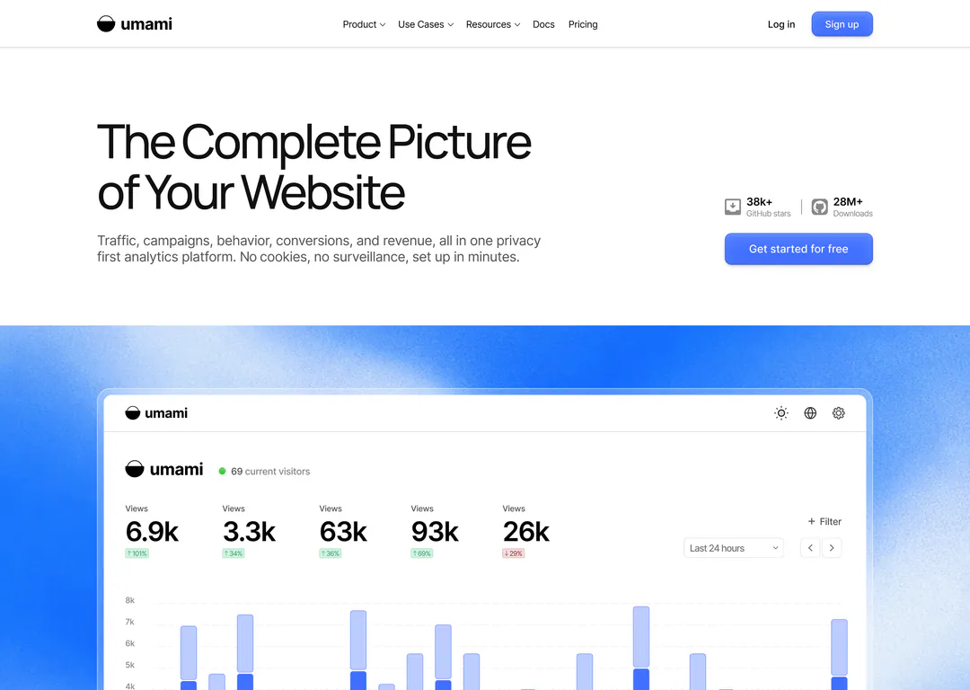
Umami is open-source, cookie-free web analytics. I redesigned its landing page to put the real dashboard up front and cut every section down to one idea.
RedesignOverview
- What it is
- A privacy-first analytics platform: traffic, campaigns, behaviour, conversions and revenue without cookies. The page has to win over developers who care about privacy and marketers who want answers.
- What I did
- Redesigned the full landing page, from hero to footer. Same product, same story, with fewer words and much bigger, clearer product shots.
What wasn’t working
- 01
The product is too small to read
The hero dashboard sits small and centred on grey, so the numbers that sell Umami are illegible at first glance.
- 02
Feature cards that all look the same
Acquisition, Behaviour, Conversion and Revenue are four text-only boxes with a tiny icon. Nothing tells you which one matters to you.
- 03
Long paragraphs in every row
Most feature rows carry four to six lines of body copy plus a “Learn how to…” link. Skimming the page means reading it.
- 04
Flat rhythm, weak ending
Every section uses the same layout until a black privacy block cuts in. The final call to action is a single line that’s easy to scroll past.


Key decisions
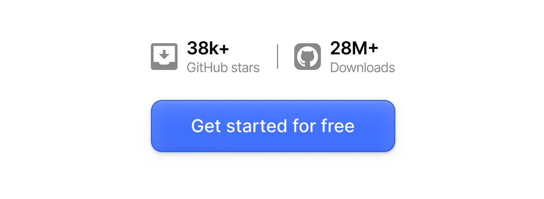
01/06Proof sits on top of the button
People decide whether to click at the moment they look at the button, so the GitHub stars and download count sit directly above it. On the live page they were split between the nav bar and a section near the footer.
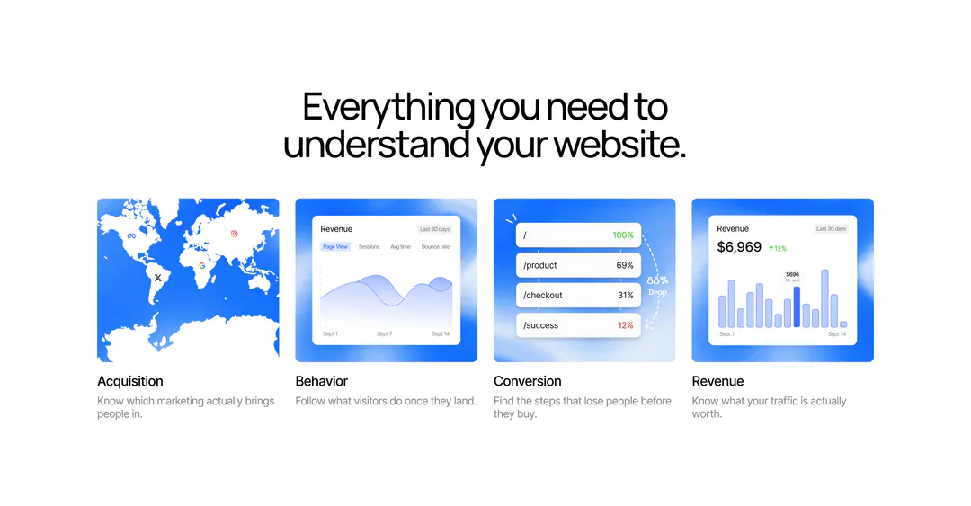
02/06Show the report, not an icon
Each card previews the actual report it describes, with a one-line label. All four can be understood in a few seconds without reading a sentence.
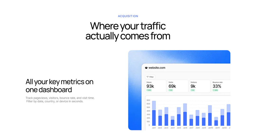
03/06Two lines and one big screenshot per row
I cut every row to a headline and about two lines, and cropped each screenshot to the part being described. The shared blue frame makes the whole page read as one system.
04/06One example per theme
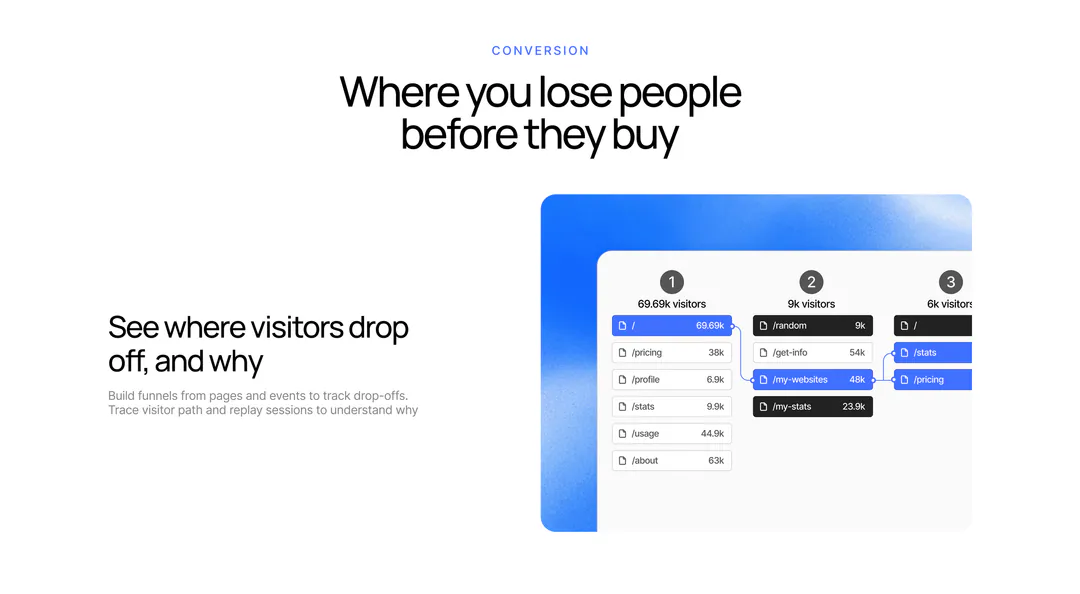
Behaviour, conversion and revenue each get one headline and one concrete example, like this funnel. I dropped the extra rows (journeys, retention, payment integrations, MCP) because every extra row pushes the call to action further down.
05/06Privacy in the same visual language
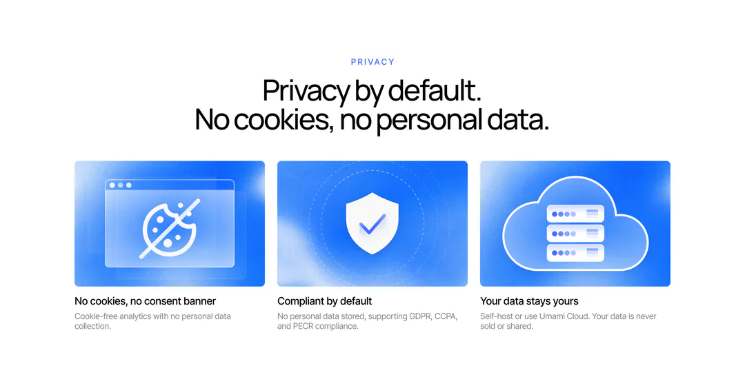
The live page switches to a black block for its most important promise. I kept the page’s light, blue system so trust reads as part of the product, not as an interruption.
06/06A closing ask with real weight
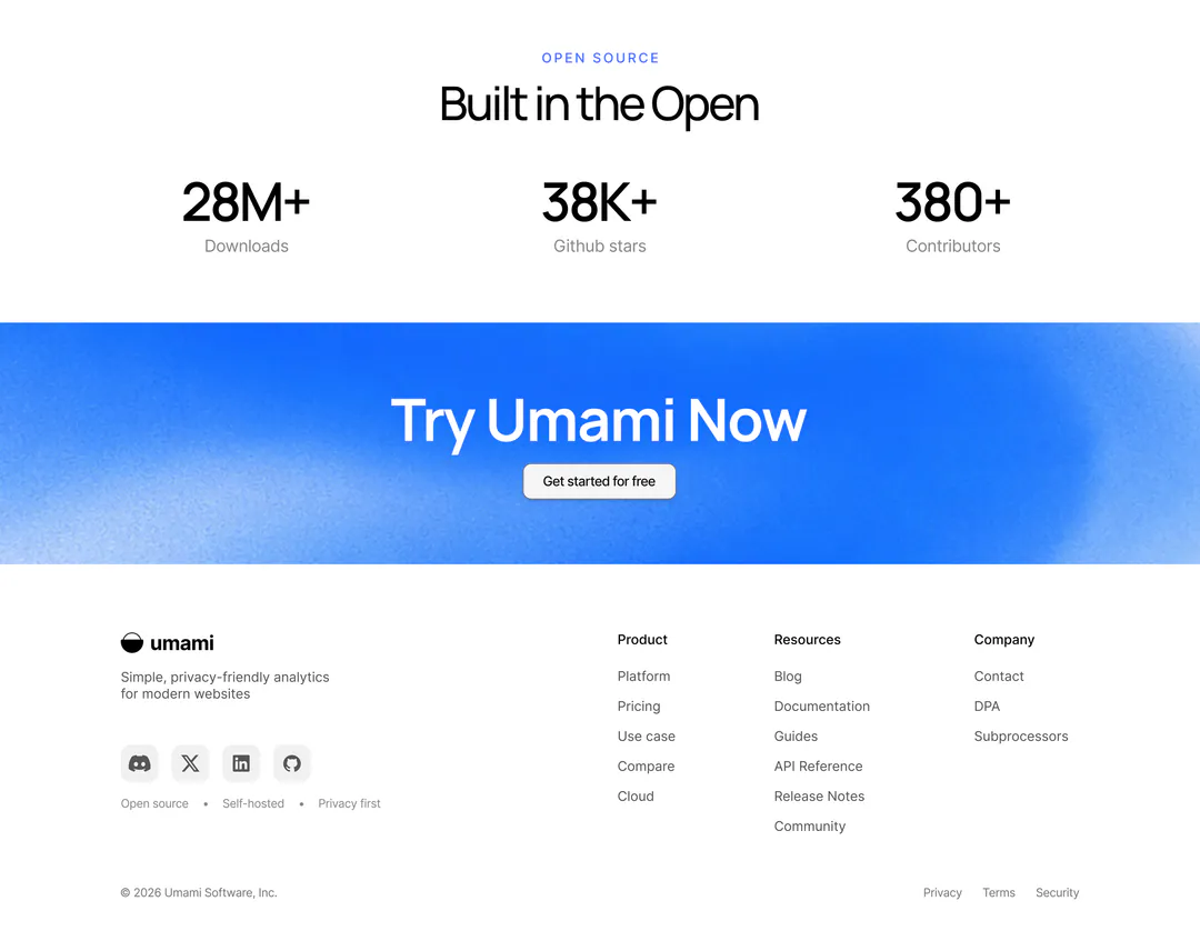
Open-source numbers lose their boxes and become big type. The final call to action gets a full-width blue band, so the last ask is the loudest thing on the page.
What I’d test next
- 01Click-through on “Get started for free” with and without the proof directly above it.
- 02Whether people look for the removed rows: track visits to the journeys and retention pages.
- 03A five-second test of the hero: can people say what Umami does?