Landing page
Redesigned around one prompt
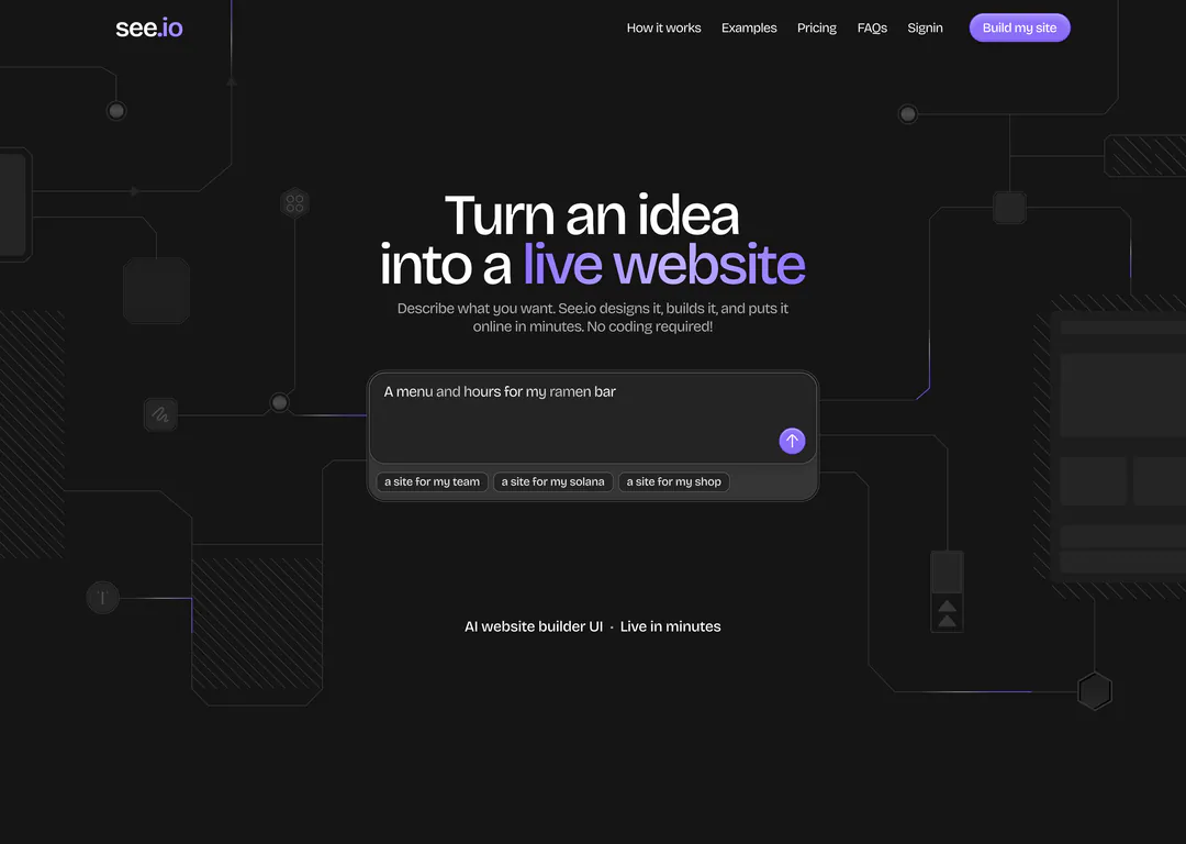
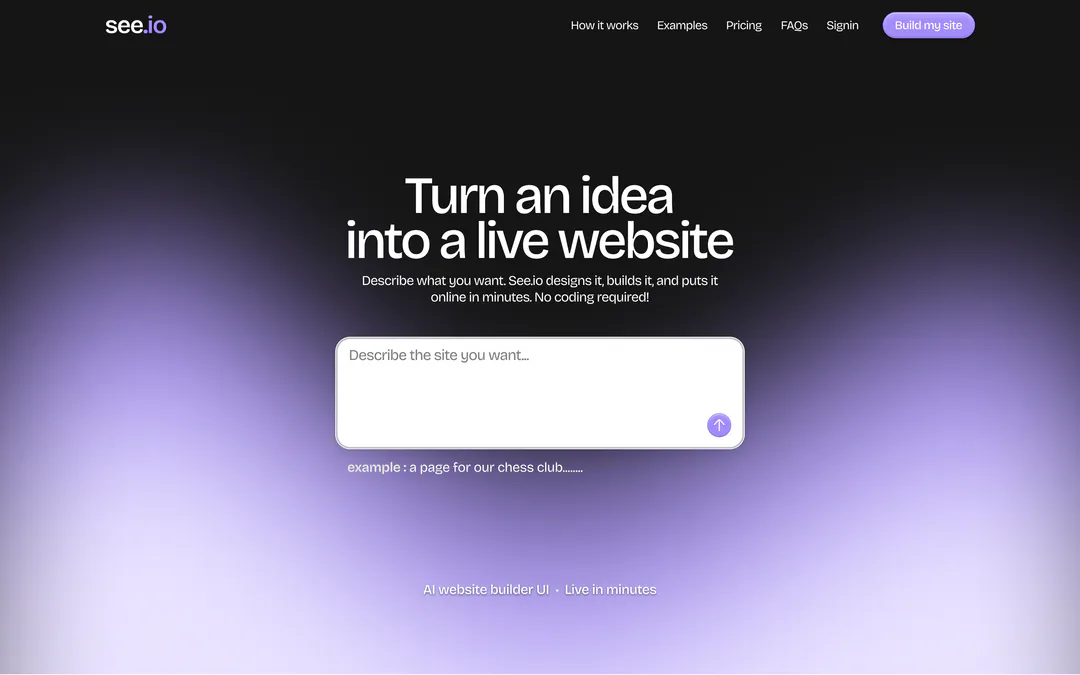
See.io turns a sentence into a live website. I redesigned its landing page so the first thing you see is the thing you do: type your idea.
RedesignOverview
- What it is
- An AI website builder: describe the site you want and it designs, builds and publishes it, with every change saved as a version.
- What I did
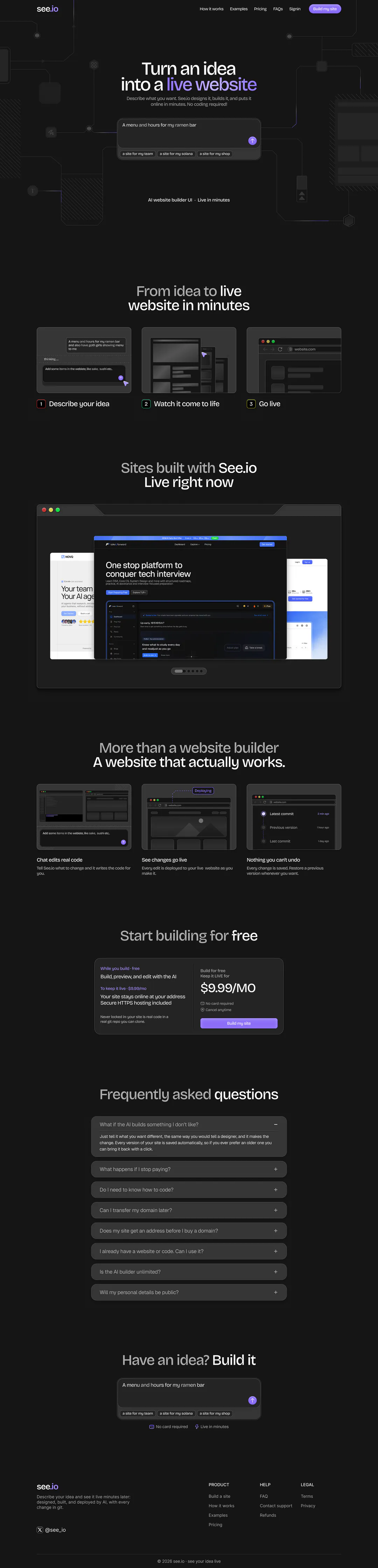
- Redesigned the landing page end to end. The live hero crammed the prompt, chips, a large button, steps and a preview into one screen; I gave each its own section and left the hero one job.
What wasn’t working
- 01
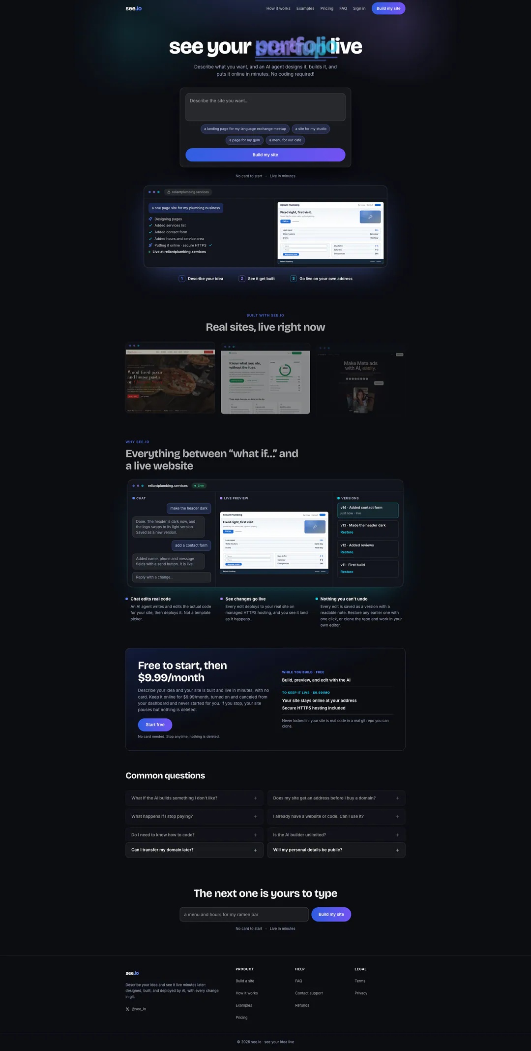
A headline you can’t read
“see your portfolio live” is set with overlapping, scrambled letters, so the one line that should carry the promise reads as noise.
- 02
Everything in the first screen
Prompt, four suggestion chips, a full-width gradient button, three steps and a product preview all compete before you scroll.
- 03
Proof that’s too dim to prove anything
Example sites are small, dark thumbnails, and much of the supporting copy is small grey text on near-black.
- 04
Dense pricing and FAQ
Pricing is a paragraph beside a split panel, and the FAQ is a two-column grid of eight questions that’s hard to read in order.
Key decisions
01/05One input, one action
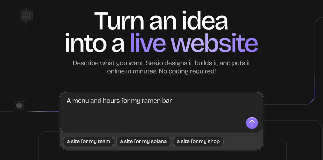
The send button lives inside the prompt and three example chips hang off it, so there’s no separate button to hunt for and no blank-page problem. Purple lands only on “live website”, the promise.
02/05The direction I moved away from
An earlier version used a purple glow and an empty prompt with a text example. I chose clickable chips over the text example because a chip is one click to try, and the circuit lines hint at “building” without glowing over the input.
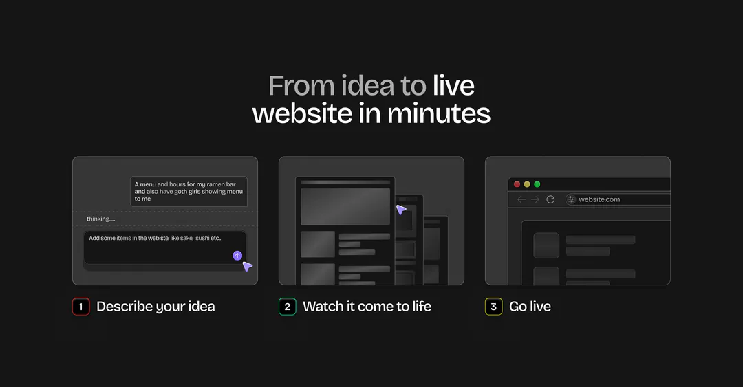
03/05Three steps, three pictures
The steps moved out of the hero into their own section. Each gets a small illustration of the actual moment, and a numbered badge so the order is obvious at a glance.
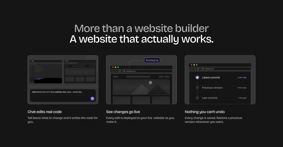
04/05Features shown as product moments
Each card illustrates the claim it makes: the chat box, the deploy tag, the version history. The headline sets a grey first line against a white second line, a pattern repeated on every section.
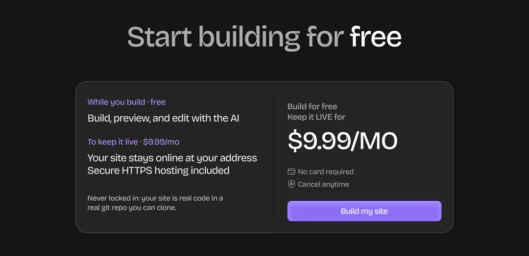
05/05Pricing as one card
What you get on the left, the price and the button on the right, with two worries (a card up front, cancelling) answered under the price. The page then closes with the same prompt box as the hero, so the last action is the first one you learned.
What I’d test next
- 01Prompt submissions with the example chips against an empty prompt.
- 02Whether the showcase carousel gets clicked, or a static grid of examples does better.
- 03Which FAQ items get opened, to decide what should move into the page itself.