Landing page
AI agents, made concrete
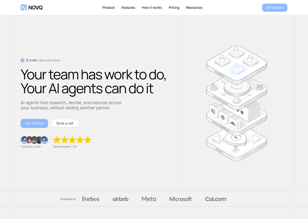
Novq is an original landing page I designed for a platform where AI agents research, decide and execute work for a team. One illustration style carries the whole page.
OriginalOverview
- Goal
- Make an abstract product, AI agents doing real work, feel concrete and safe within one scroll.
- Audience
- Team leads and operators at growing companies. They are curious about automation but worried about control, security and setup effort, so the page answers those three.
- Approach
- Three rules for every section:
- One illustration language: grey isometric line art with a single soft blue.
- Visible structure: thin vertical rails and dividers, like a blueprint.
- Every claim gets a picture or a number next to it.
Key decisions
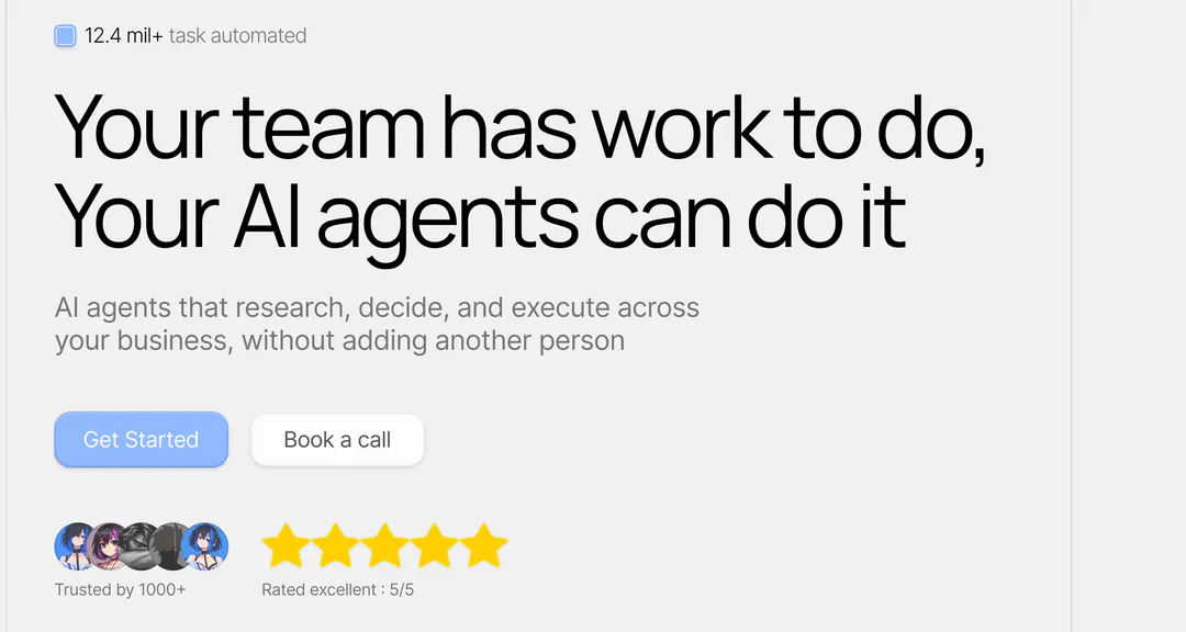
01/06Say the job, then lower the risk
The headline names the outcome in plain words. A low-commitment “Book a call” sits beside “Get Started”, and avatars with a 5/5 rating answer “does this work?” before the first scroll.
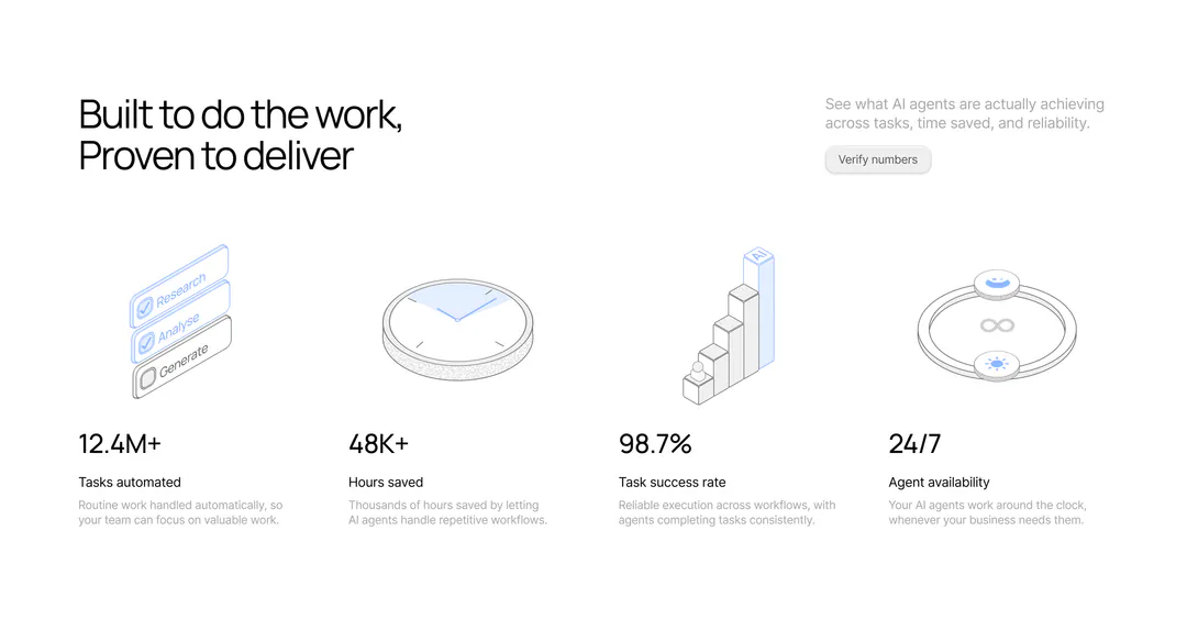
02/06Proof comes second, not last
Right after the hero, four numbers each get an illustration, a label and one line. A “Verify numbers” button sits beside them, so the claims don’t ask for blind trust.
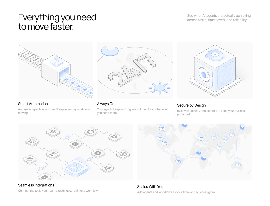
03/06A bento instead of a list
Three cards on top and two wide ones below break the grid so it doesn’t read as a uniform list. Each illustration is the idea itself: a conveyor for automation, a vault for security.
04/06Setup in three verbs
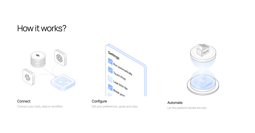
Connect, Configure, Automate: one word, one line and one picture per step, so setup looks as small as it is. The settings checklist shows that you decide what the agents may touch.
05/06An FAQ that shows how it works
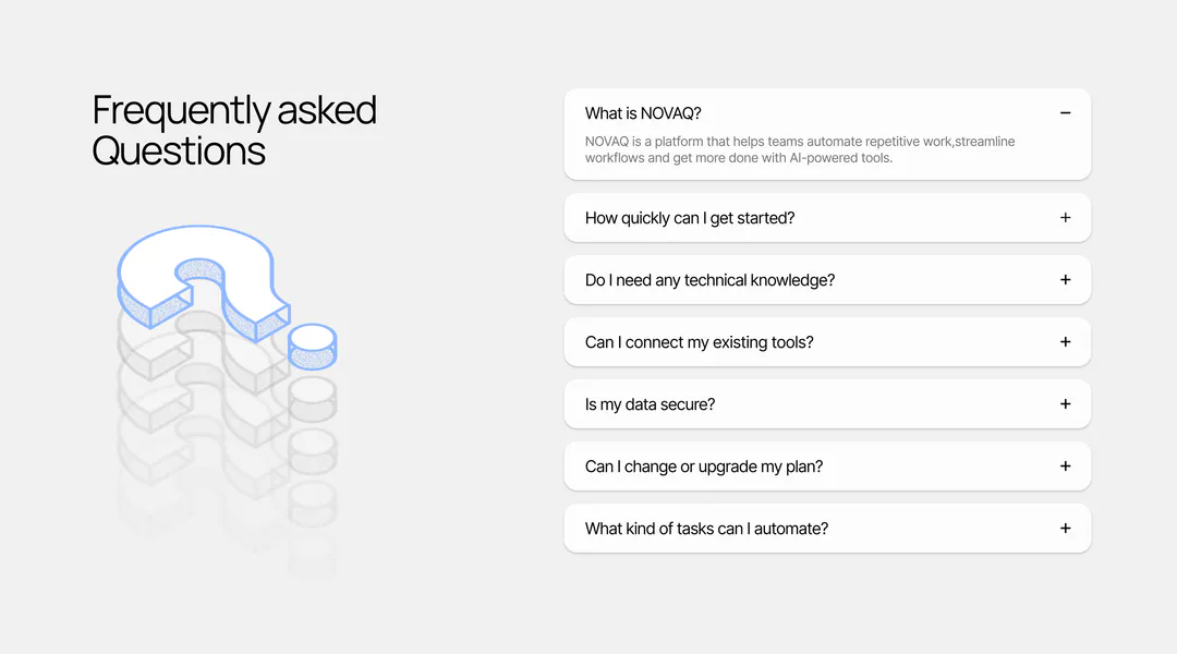
The first answer is open by default, so it’s obvious every row expands. The questions follow the audience’s worries in order: getting started, skills needed, tools, data security, plans.
06/06End on the brand
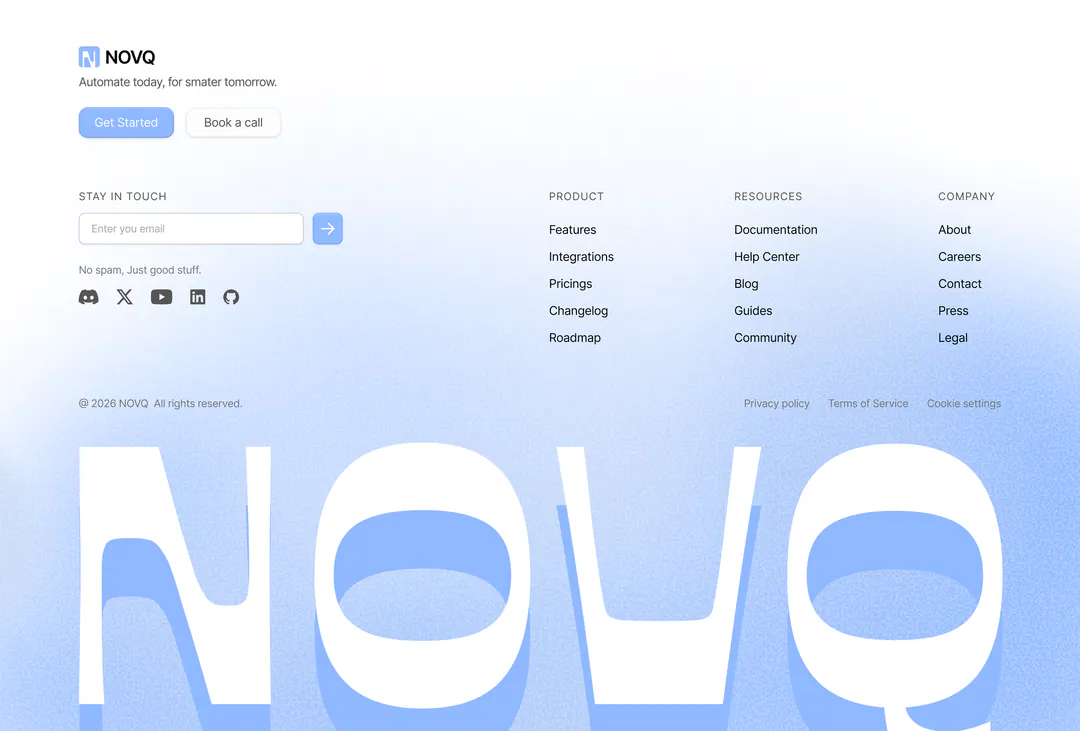
The final call to action repeats the hero’s two buttons inside soft rings. The footer ends with an oversized NOVQ wordmark, so the name is the last thing on screen.
What I’d test next
- 01The angled “Why choose us?” list against a flat list: tilted text may be harder to read.
- 02Whether “Book a call” pulls clicks away from “Get Started” or adds new ones.
- 03Contrast of white text on the light-blue primary button.